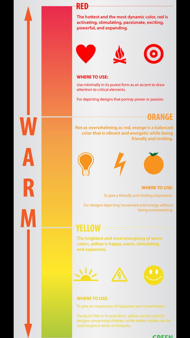
Colors are a very important factor to consider when creating a magazine cover. Depending on what colors are in use will define how the magazine attracts a specific type of audience, which in my case would be people from ages 18-35, and how they feel while viewing it.
For my magazine cover I've decided to use dark colors such as black and white for a more serious tone, and try to prevent using bright colors. The limited use of colors is because instead of focusing on warm elements like National Geographic does, I'm leaning more towards the aspect magazines such as "Science" or "Discover" try to achieve which is neutral or cool.
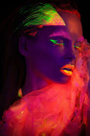
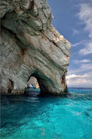
I'm still unsure of what specific image I'm trying to use, but I believe I'll be using a realistic picture instead of a photo shopped one.
National Geographic vs Science:
Realistic vs Photoshop:


Citations:
Stoklosa, T. (2015, March 03). Media - Print. Retrieved March 03, 2018, from https://www.pinterest.com/pin/495747871457529814/
POPULAR SCIENCE. (n.d.). Retrieved March 03, 2018, from http://1stchoicemags.com/magazines/index/mag_id/1087/title/POPULAR-SCIENCE
Coontz, M. M., Science06 Mar 2015 : 1082-1083 Full AccessRestricted Access, Cho, A., Science06 Mar 2015 : 1084-1088 Full AccessRestricted Access, Conover, E., Science06 Mar 2015 : 1085-1097 Full AccessRestricted Access, . . . Paul Robertson, Suvrath Mahadevan, Michael Endl, Arpita Roy. (2015, March 06). 347 (6226). Retrieved March 03, 2018, from http://science.sciencemag.org/content/347/6226
17, 2. D., & 17, 2. J. (2017, July 26). Artificial intelligence. Retrieved March 03, 2018, from http://www.sciencemag.org/topic/artificial-intelligence
Society, N. G. (n.d.). Sign in or Subscribe to Access Over 1,400 Issues. Retrieved March 03, 2018, from http://archive.nationalgeographic.com/dynamic/National%20Geographic%20Society/National%20Geographic/Landing.aspx


 2.
2.